Request a Quote

Services Needed:

 Custom Web Design  E-commerce Solutions  Logo & Graphic Design  Web Marketing  Search Engine Optimization  Web Hosting

When Photos Make a Site Pop!

shaun smith1Staying on top of your brand and style is something Shaun Smith Homes does with ease. A New Orleans Boutique and Interior Design firm recently launched their new logo and portfolio and ecommerce site. Partnering with Design Burd the process started with creating a simple but recognizable logo. From there the design of the homepage and interior pages laid out a clean modern design.

The site includes a portfolio of projects as well as a fully integrated ecommerce site. Products that represent the style of the firm can be sold online or at the Uptown Magazine Boutique!

Possibly Related Posts:


Share

A New York State of Mind

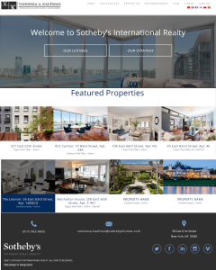
Real Estate Web DesignCan you picture yourself in this home? If there is a site that will help you do so it is vannessakaufmanre.com. Design Burd is working with Sotheby's Real Estate brokers in New York to create unique sites to display their properties and strategy.

This brochure site not only tells you a story of how and why you should work with Vannessa Kaufman and her team, but it details how your property will be sold. A comprehensive process that will have your listing show in print, digital and word of mouth!

Possibly Related Posts:


Share

Tips for Starting Your Own E-Commerce Website (more research)

You never know what kind of future your online store will have once it's launched. However, we at Design Burd know a thing or two about what it takes to create a successful e-commerce business. We put together a few tips to help you get started.

1. Make Your Logo Clear
This is probably the most important part of recognition to your brand. A clean and crisp logo pretty much is a business car for store branding, especially when it comes to shopping online. The logo becomes a reassuring symbol for when someone comes across your website. A good strong logo is a reassuring element or trust that a browser will subconsciously recognize.

2. Social Media Integration
So much of online purchases now a days are accomplished from surfing through social media sites. People are inclined to take in public opinion, like, and share your products. Websites such as Twitter, Facebook, Instagram, are the best sources to get the information you want on almost every topic or product.

3. Take Great But Real Photos
Nobody like making a purchase, unwrapping the box to realize they got burned. People are more likely to purchase from a site again even if they did not love their first purchase as long as the product was represented correctly. Over the top photos or supplier photo will not transition into sales.

Possibly Related Posts:


Share

Things To Know When Naming Your Business

designburd-blog-posts-naming-your-business-image

When it comes to starting your own business one of the first steps to using your creativity is trying to find a name for your business. The most common default is to name a business after your own name, which isn?t a bad default if it fits your type of business. Some designers will even use their own initials and attach their discipline to clarify the meaning of their business. (Example A.B Cuttery, or AVDesign.We?ve come up with some important steps to remember when coming up with a name for your business.

What Kind of Visions & Values Do You Have for Your Business?

The name of your business should reflect this first question. Find out what really is important to you and your work, as well as how you work with others. Is it your innovations? Professionalism and expertise? Or it could be playfulness and sustainability. Who inspires you?
For these questions to pan out visually for you, write down 10 descriptive words about your visions and values. This will help you use these words as a starting point for brainstorming. Don?t be afraid to ask the help of friends and family for starting off points. Since your visions are unlikely to change for your company, looking at the ?big picture? of your business will help ensure the future of your business all within the name.

Does the name of your business reflect your target market?

The name of your business will reflect not only yourself, should attract the type of people you want to be consumers. The name of your business is completely parrallel to your own name when introducing someone. The first time a person hears it is the first impression they get. Test out the name of your business by closing your eyes, saying the name and try to envision what image you have in your head. Do this to yourself, and also try this on others to see if it?s the same.

Checking The Name

- Make sure the name of your business is easy-to-spell, especially for others, this will make it easier for people to find your business online and on other social media sites.
- Make sure the name of your business is easy-to-remember. If you have something memorable it?ll be easy for people to find your business online.
- If your business works internationally, make sure that your business name isn?t offensive in other languages. If you do your researcg there are a lot of funny stories about offensive name brands.
- Make sure the name of your business is future proof, because it?s always harder to change the name of yourbusiness once you havebuilt a solid profile for the company. Try and consider the name of your business is like naming your child. It?ll stick with you your whole life if that?s your intent.

Possibly Related Posts:


Share

5 Web Design Mistakes that Small Businesses Should Avoid

Now a days a websites for your business act as a hub. However when it comes to small businesses, your website plays a crucial part for your branding. ALthoug it?s important to make it easy for potential customers to locate your comany on the web, it?s just as important to make sure that once they?re browsing your site, to make their needs for simple user experience, easy to read content, and an intriguing design. The simplest mistake to your website can turn down potential customers.

We?ve come up with 8 web design mistakes that you can avoid for your small business.

1. Going Overboard with the Design.
designburd-blog-posts-going-overboard-example

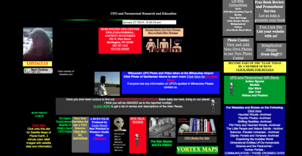
It?s very easy simple to get caught up in having a flashy and eye-catching website, however it is not an effective marketing strategy. Going overboard on the design for your site will end up looking cluttered. You want your customers to spend little time on your site. Think more about how to attract users, which is easy to do with a simplistic design. One thing to remember when designing your site is that the visitors to your site most of the time already know what they want, they need to be able to figure out there next time easily on your site, before you send them to your competitors website.

2.Broken Social Media Links

designburd-posts-broken-link-image

It happens every day, when someone goes to a website and clicks on the Facebook, Twitter, or any social media link in the footer or header and the link happens to be broken. Which is a huge failure to your business if this is gonna be your first impression with a customer. This will make the customer wonder what?s wrong with your site, also deprives them of the opportunity to learn more about your companies interaction with people on a social level. Ensuring this is simple. Just regularly checking to see if your social media buttons are linked to the correct destination.

3.Not Changing the Color on Visited Links
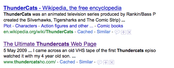
designburd-blog-posts-no-changing-color-example

It happens every day, when someone goes to a website and clicks on the Facebook, Twitter, or any social media link in the footer or header and the link happens to be broken. Which is a huge failure to your business if this is gonna be your first impression with a customer. This will make the customer wonder what?s wrong with your site, also deprives them of the opportunity to learn more about your companies interaction with people on a social level. Ensuring this is simple. Just regularly checking to see if your social media buttons are linked to the correct destination.

4.PDFs for Online Reading
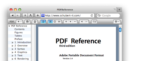
designburd-blog-posts-pdfs-online-reading-example

It happens every day, when someone goes to a website and clicks on the Facebook, Twitter, or any social media link in the footer or header and the link happens to be broken. Which is a huge failure to your business if this is gonna be your first impression with a customer. This will make the customer wonder what?s wrong with your site, also deprives them of the opportunity to learn more about your companies interaction with people on a social level. Ensuring this is simple. Just regularly checking to see if your social media buttons are linked to the correct destination.

5. Overlooking Your Target Audience

designburd-blog-posts-overlooking-audience-example

When rushing to get your website done and running it?s easy to overlook your target market. You need to research who your target audience will be before your website can be successful for your business, and use that research to consider how to design your site and what kind of imagery will be relatable to your audience. For example if your website is marketed to women from20 to 30, consider using youthful color schemes and bright imagery that also is responsive to mobile. If your target market is to an older crowd, try using larger font sizes and have the color contrast be very dark on light, also to have the user experience be as easy as possible. It?s not easy to target your audience, but if not, you maynot be pleasing anyone if you?re trying to please every type of audience on your site.

Possibly Related Posts:

~ Comments Off on 5 Web Design Mistakes that Small Businesses Should Avoid

Reasons Why WordPress is the Best Choice for Your Business.

1. WordPress is a very flexible and open source.

Everything that wordpress is made up is a complete open source. Meaning your functionalities to your site, as well as features (such as Comment, Galleries, etc) are all regularly updated by WordPress developers on their database. Which is great! Because it forces developers to continuously stay up on the trends of industries. One of the most important reasons why it?s so great that WordPress is an open source is that developers are there as soon as possible to catch any bug in the system/coding and are able to close everything down for you within the same day.

2. Easy to manage content.

The tool for content management is so easy to comprehend that you can update and upload pages on your own. With just a few simple steps, you?re able to add content to your site such as pictures, events, and even products whenever you want! This comes in handy when saving your business money. Some developers will ask money for those kind of updates, however wordpress makes it simple enough for you to do it yourself. It takes less than an hour to learn how to simply change your content or add photos, and that?s where Designburd helps you. We?ll show you step by step how to manage your very own content.

3. Extended Plugins

So you want your background to fade in and out different images every 5 seconds? Great! There?s a plug in just for that! And almost anything that you?d like to add to your sight. By using wordpress you?re able to sure different plug ins and test them yourself without having to go through a developer. Curioius about how many readers are on your website right now? Well, there?s a plug in for that too. The core functionality of wordpress is very simple, however that relatable plug ins for users is simple outside of the box. And if you do need a developer to help you edit a plug in just a little, wordpress gives the developer room to play with the PHP which makes all plug ins very flexible.

4. Your?e Able to Add a Blog Yourself

It?s important for your small business to have a blog, or some sort of post to interact with your customers and keep them up to date with your business. With wordpress most themes are blogs. You can literally add a blog within minutes to your site. WordPress makes.

Possibly Related Posts:


~ Comments Off on Reasons Why WordPress is the Best Choice for Your Business.

Web Design Forecast for 2015 So Far.

As a web design company it?s crucial to stay intuitive of the direction that design and development is going. ?We don?t want our clients to have an anachronistic site design and be behind of their competition, so we?ve done a little research. One thing about all design that?s unquestionable is that everything is getting more and more simplified for users. The simpler the design, the better. We?ve drawn out a list of 5 trends that any entrepreneur should be aware of as we approach mid 2014, especially for start ups, ?or companies revamping their identity.

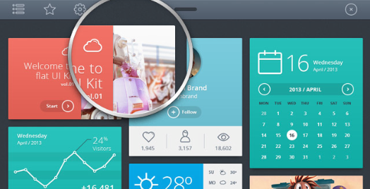
1. Flat & Simple Design.

designburd-blog-posts-flat-design

It looks so far that we're goodbye to drop shadows and gradients. Those were two ?go-tos? that a lot of designers would you to jazz up their design. This simplistic approach is leading designers to think outside the box, using icons and flat colors to be the foundations of design. Notice in 2013 Apple relaunched their new iOS7 and everything become 1 dimensional and simplified shortly after Windows 8 became all solid colors and easy to navigate as well. So far we've start to see this trend expand to smaller businesses. Not investigating of who was the trend setter to ?flat? design , but we can definitely agree that this will continue in 2014.

2. Heroes Are Becoming the New Sliders

designburd-blog-posts-hero

If you haven?t heard of a hero area yet, you will by the end of 2014. It?s pretty much the ?intro/top? part of the website. Instead of a slider, you?ll start to see a larger slider, or just an image taking over the entire background of the website with very little text Let?s face it, people don?t like to read much and prefer imagery to guide to help understand something rather than doing much investigation. So ?the simpler the better? approach doesn?t only apply to icons, but to the reading as well. Check out this List 25 Sites with Heroes to get a better understanding of a hero area.

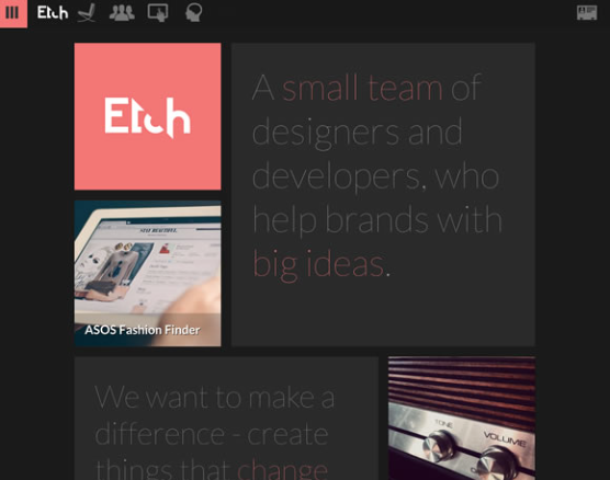
3. Cards/Tiles Will Continue to Grow

designburd-blog-posts-card-tiles-example

As we design for clients we?re noticing that there is a re-architecture for the web that?s straying away from pages to cards This is driving websites from having many pages of content linked together, pieces aggregated togehter into one experience. . Content is starting to become broken down into cards mainly because almost all website are (and should soon be responsive). Cards make is easier to re-aggrate for the rise of mobile technologies, and other screens of unique shapes and sizes.

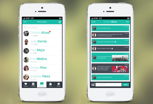
4. Mobile is Becoming the Primary

designburd-blog-posts-mobile-example

Because almost every website is becoming responsive, we?re starting to notice website with a deeper focus into the mobile lifestyle. Designers and developers are more focused on working their sites into mobile devices. This is very common with small businesses and will continue to grow. More people access the internet on their phone and other mobile devices such as tablets and pads. The typical layout designed just lap tops and computers

5. Less Text.

designburd-blog-posts-less-text-emaple

Towards the end of 2013 we noticed that the web has become less text-heavy. Even some apps have almost no visible text and relying on icons, videos and images t convey information to users. In a lot fo cases it works very well, for example for Snapchat homepage, which contains less than 10 words and requiring users to watch the video to make sense of the app.

Possibly Related Posts:


~ Comments Off on Web Design Forecast for 2015 So Far.

A New Skin for PoeyFarre

We're happy to re-vamp PoeyFarre's Website. We created new social media icons for its integrations, as well as enhancing the SEO. A new footer layout that is more modern, helping the site be more user friendly. We even edited the photos for the customized gallery we built as well. Take a look at the upgraded PoeyFarre website today!

Possibly Related Posts:


~ Comments Off on A New Skin for PoeyFarre

Brand New Website for Central Lakeview

image017

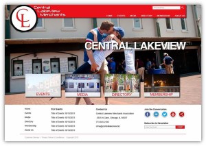
We're extremely excited to design, host and maintain the brand new website for Central Lakeview Merchants. The site itself was completely revamped with a new color scheme, layout, and beautiful business directory that features a large scale map displaying the locations of the businesses. Not only can customers search the name of businesses, but even filtering down the type of business they're looking for.

Possibly Related Posts:


~ Comments Off on Brand New Website for Central Lakeview

Take a look at Carl Little Law

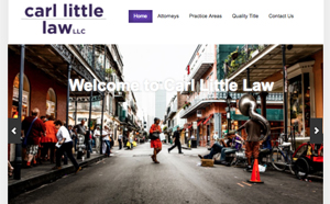
Carl Little Law is a brand new law office in the heart of New Orleans. The large image slider shows vibrant, eye-catching photos of the colorful city, creating a wholesome connection with the culture of New Orleans. Check out Carl Little Law!


Possibly Related Posts:


~ Comments Off on Take a look at Carl Little Law