Now a days a websites for your business act as a hub. However when it comes to small businesses, your website plays a crucial part for your branding. ALthoug it?s important to make it easy for potential customers to locate your comany on the web, it?s just as important to make sure that once they?re browsing your site, to make their needs for simple user experience, easy to read content, and an intriguing design. The simplest mistake to your website can turn down potential customers.
We?ve come up with 8 web design mistakes that you can avoid for your small business.
1. Going Overboard with the Design.

It?s very easy simple to get caught up in having a flashy and eye-catching website, however it is not an effective marketing strategy. Going overboard on the design for your site will end up looking cluttered. You want your customers to spend little time on your site. Think more about how to attract users, which is easy to do with a simplistic design. One thing to remember when designing your site is that the visitors to your site most of the time already know what they want, they need to be able to figure out there next time easily on your site, before you send them to your competitors website.
2.Broken Social Media Links

It happens every day, when someone goes to a website and clicks on the Facebook, Twitter, or any social media link in the footer or header and the link happens to be broken. Which is a huge failure to your business if this is gonna be your first impression with a customer. This will make the customer wonder what?s wrong with your site, also deprives them of the opportunity to learn more about your companies interaction with people on a social level. Ensuring this is simple. Just regularly checking to see if your social media buttons are linked to the correct destination.
3.Not Changing the Color on Visited Links
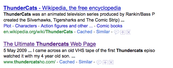
It happens every day, when someone goes to a website and clicks on the Facebook, Twitter, or any social media link in the footer or header and the link happens to be broken. Which is a huge failure to your business if this is gonna be your first impression with a customer. This will make the customer wonder what?s wrong with your site, also deprives them of the opportunity to learn more about your companies interaction with people on a social level. Ensuring this is simple. Just regularly checking to see if your social media buttons are linked to the correct destination.
4.PDFs for Online Reading
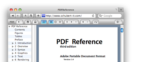
It happens every day, when someone goes to a website and clicks on the Facebook, Twitter, or any social media link in the footer or header and the link happens to be broken. Which is a huge failure to your business if this is gonna be your first impression with a customer. This will make the customer wonder what?s wrong with your site, also deprives them of the opportunity to learn more about your companies interaction with people on a social level. Ensuring this is simple. Just regularly checking to see if your social media buttons are linked to the correct destination.
5. Overlooking Your Target Audience

When rushing to get your website done and running it?s easy to overlook your target market. You need to research who your target audience will be before your website can be successful for your business, and use that research to consider how to design your site and what kind of imagery will be relatable to your audience. For example if your website is marketed to women from20 to 30, consider using youthful color schemes and bright imagery that also is responsive to mobile. If your target market is to an older crowd, try using larger font sizes and have the color contrast be very dark on light, also to have the user experience be as easy as possible. It?s not easy to target your audience, but if not, you maynot be pleasing anyone if you?re trying to please every type of audience on your site.
Possibly Related Posts:
- Tips for Starting Your Own E-Commerce Website (more research)
- Things To Know When Naming Your Business
- Reasons Why WordPress is the Best Choice for Your Business.
- Web Design Forecast for 2015 So Far.
- A New Skin for PoeyFarre